Tuesday, August 28, 2007

Flowies!


Hallmark flowers decided to take advantage of online flower delivery as ordering online gets the flowers to the recipient with one week extra freshness as there are less middle men. Hallmark called upon Willoughby Design Group to create a brand identity for them communicating the message of their expertise.
Hallmark is the leading brand of ‘personal expression’ and Willoughby Design Group was to persuade the consumer that Hallmark’s expertise would genuinely fulfill their needs of giving a satisfying, pleasing bunch of flowers that communicated aptly the message to the recipient. Their designs would cover all aspects of consumer contact from Hallmark stores, online to the packaging and experience of the product, although their main focus was on the packaging as the most important aspect is the moment of delivery and enjoyment. Packaging included items such as the box, flower wrap, the sticker that holds the wrap together and small greeting cards for which they were advised to use photographic styles from which they developed muted Victorian style flower patterns with the ‘flowers’ brand name infused among them for the wrapping paper. They developed a colour palette based on Hallmarks main brand colours of plum and gold, which needed to work for a wide range of occasions so the palette included lush light and deep purples and blues to mauve-reds, and golds from pastels to deep-almost-brown, golden peachy colours. The brand name of ‘flowers’ was written in sophisticated, elegant writing enforcing the high class of their product and delivery.

I found it very interesting finding out about this design process and development as it is a brand within a brand, so they had a lot to base their concept on yet had a lot of room to move as it was a leading company extending to new avenues. This site of case studies I think is high quality and I found it comforting how they show you what steps they took to reach their solution because you don’t usually get to see that. It opens you up to the world of designing for someone (company or organization) who wants something quite specific.

tomato design

The cutting edge design company tomato is based in the U.K. and has clients on their list like BMW, Nike, Adidas, Casio, Seiko, Japanese mobile phone site Stijl, Wired Magazine and Italian Fashion house Aspesi. One of the case studies on their website is that of the Italian furniture company B&B Italia. Tomato were briefed with rebranding and coming up with an identity for the Italian company for print. The campaign consisted of beautiful photographs of the furniture often cropped and against plain white backgrounds. The second series of print ad’s were text only and describe the desirability and appeal of the product-essentially the intangible. True identity creation.

I like their design…it’s simple and strong. And I love their use of type. With emphasis on bold, all caps typography. So they’ve let the furniture speak for itself and the wording is clever and minimal. A classic case of simply articulated good design.

Here’s the link if you wanna check them out…http://www.tomato.co.uk

Process of design - defining - Qantas

I wanted to talk about the new logo for the Quantas identity and corporate logo.

Their problem was obviously the logo seemed outdated and needed a new more modern look at the red and white kangaroo logo, seeing as the first design has been un-altered since 1947, and they wanted the kangaroo to look more an outback styled kangaroo I guess it seemed a change was in order.

Their main problem was with the kangaroo’s leg coming into contact with the tail on the planes, and having needed a painting job underneath it to continue the leg of it without it looking too short etc.
They also needed to keep up to date with today’s modernism in design, by making it more slick, more flowing, still resemblance of a kangaroo but not blatantly obvious as a character design, plus I think they wanted to change the old typeface because it looked too 80’s

At first I didn’t really like it, I looked at the older one thinking it resembled a kangaroo more than the new one did, and that it was fine the way it was.
First glace I pretty much found all the problems with the new one but later realised they are all justifiable changes.
It works more as a logo I think with the new slick design of a non-obvious kangaroo character, I mean it obviously is a kangaroo, but less blatant I think, and work both ways now.
Now actually noticing more how the leg goes through the wing it bugs me and makes me pretty much want to edit it out myself….

I think its good they changed it, but not so much as to obliterate the Australian aircraft icon

I don’t know why the sudden change or why it took them like 60 years to change it, but at least they didn’t ruin it like they did the Olympics.


Jess - Selling the Solution


YEN MAGAZINE

YEN's worldwide network of friends and contributors come together to share their opinions and experiences. Where the kids who create, the kids who inspire and the kids who inform can air their dreams, their desires and the issues that are getting them irritated. Relaying both what's cool and what's really significant in each city - the issues causing a stir straight from those it's happening to.

YEN magazine launched five years ago in Australia as a reaction to women's magazines that lacked both substance and style. YEN was originally unveiled as a 32-page mini magazine, free on the streets of Sydney, Melbourne and Brisbane. Thanks to the support of an amazing collective of contributors and supporters hungry to get involved, YEN quickly evolved to it's current format and can be found in newsagents and specialty stockists all over Australia as well as many countries worldwide.

This magazine is a benefit to a lot of women around Australia because of the the depth it goes into in all areas other then just beauty etc. YEN is so popular because of the issues and articles it brings to its readers because a lot of people are always looking for something more then just your average womens magazine.

Personally I believe that the selling sollution of YEN is inspiring, and I enjoy reading the articles YEN creates.

URL:
http://www.yenmag.net/about/
I had a good look around but couldn't pass this up, from an American magazine(CORE 77), about some Polish architects.


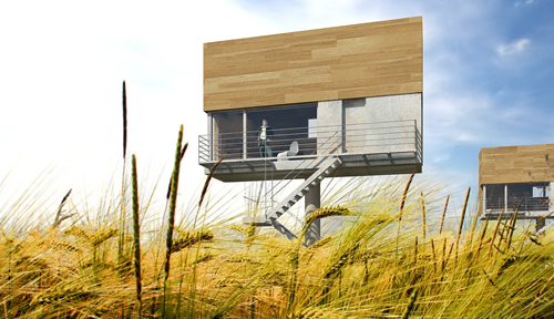
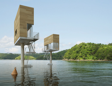
Like an inhabitable billboard, the Single Hauz – by Poland's front architects – proposes cantilevering domestic living space from a central mast. The house can then be installed above a variety of ground conditions, from the middle of a meadow to an urban core.
Personally... I'd put it in a lake.


The cool thing is that I've actually spent 11 months of my life staring up at some of the Herculean billboard structures in Los Angeles; they tower over intersections on streets from Venice to Sepulveda and often seem as large as houses.
But how much weight could a billboard carry?


Could you build a house up there?
Could you use the mast-and-cantilever model for other types of architectural structures, whether those are single-family houses – whole cul-de-sacs lined with modernist billboard homes! – or even restaurants and public libraries?
The Single Hauz shows how beautiful the effect could be.


For more projects by front architects, check out their website (though I couldn't find any information in English). www.frontarchitects.pl

ITALIAN MAG


ARTLAB is an Italian Design magazine, which provides new and sometimes confronting images and designs in the world of graphic design. These images can sometimes shock the audience and they make the viewers question and take interest in the motive and the message conveyed. This magazine focuses on different imageries and each issue centres on a specific theme or graphic style that is the hinge-pin for articles in the areas of: design, top applications, contemporary art, photography, web design, illustration, fashion, music and video, environmental graphics, cinema, etc. Beyond the central theme, additional articles appear on type design, interior architecture, theatre and staging, and ethics - as well as on professional themes of general interest. I thought this magazine cover conveys the style of this magazine quite well.
Link: http://www.media.icograda.net/web/idmn.shtml?m=artlab

HEAD EXPLODY


Fiend magazine is an Australian style, art, culture and music magazine aimed at the demographic of the Gothic subculture. As well as the pleasing mix of topics, the layouts and fonts used are quite irregular, unique and unusual. It is incredible as the only colours used in the magazine are on the inside and outside of the front and backs covers. The content and design work throughout is so interesting that it makes the use of only black, white and greyscale actually complement the structure of Fiend magazine and is appropriate for the target market as its readers are probably the type not wanting to be blinded by over use of colours. This production choice is also environmentally friendly due to less harsh chemicals being used to print.
There is a general use of Gothic fonts such as the sublime, ‘Velvet’ style and old copperplate styles yet all of the typefaces intimately relate to the articles, interviews, reviews etc. whether it be about A Perfect Circle, Rammstein, The Dresden Dolls, Opeth, Man Ray, classic or modern film reviews, Platform Boots, Cemeteries, Doctor Who, or Batrisha comics. Fiend intricately intertwines all the elements to create a fascinating tasteful read.
The FIEND team consists of people in the positions of Editor, Creative Director, Sub Editors, Design + Layout, Additional Design + Layout, Contributors, Advertising and Web Design.
You must see their music review ratings > kitty rates the noise ☺I rate this mag HEAD EXPLODY BRILLIANT KITTY FANTASTICO!

Monday, August 27, 2007

paula - Pentagram gets the Sak...


This is the case study of the redesign of the logo and packaging for SAKS FIFTH AVENUE in New York, a luxury store with a long history of providing goods to its elite customers.

Saks had had a series of typographic, signature type, logos over its history, but in 2004 they wanted to bring their brand into the modern world. It was important that current customers could recognise, the progressive design as well as attracting new customers

.


One typographic image stood out from the others, it was recognisable to the masses as 'THE' saks logo even though it had been 30 years since it had been used and had been superceded several times.


After much brainstorming in the Pentagram agency the historic logo was placed within a black square and then divided into 64 smaller squares. The tiles could be infinately arranged into different outcomes, giving the designers alot to play with.

The historic colours - Black & White where retained & the recognisable signature remains. However the end result is modern & very stylish - Very New York.

I LOVE IT...

Friday, August 24, 2007

Cocojambo ~ Case study


Cocojambo is a Gold Coast graphic design company with a unique attitude toward the media industry.

Their philosophy is to change the message from “what’s being sold” to
“What’s Being Bought”.

One of their case studies particularly caught my attention when viewing their website.

THE MBO HUNTING PARTY

An investment group approached Cocojambo to come up with a strategic plan to attract ten high net worth individuals for investment into a Management Buy Out
Scheme of private companies of worth $50-$100 mill.

The advertising plan needed to convey the business concept and approach, the funds required, the acquisition targets and the exit plans.

The Cocojambo team first asked “Who are the customers?”. After research, it was evident that due to the enormous amount of screening done by staff and entourage of this elite target market, a different approach needed to be taken. The advertising package needed to be attractive to this elite market. The only thing that would interest one individual would be the other nine individuals. An elite club. Something these ten individuals could relate to and get excited by.

With a 1920’s gentleman’s club feel, “The MBO Hunting Party” was introduced.
The use of the finest paper stock, embossing, foils and metallic inks, as well as a 10 colour print process produced very personalised invitations with an aristocratic feel.
Completing the packaging with a wax seal complimented the excitement of exlcusive invitation to invest and become a part of the club.

The company directors were introduced as ‘trackers’ surveying the landscape for their target ‘game’.

This advertising strategy was not to sell anything but to communicate to their target market on a level that would interest them.

The investment group allowed six months to the review and selection process. However the allocation of available space was oversubscribed with three weeks.

I thought that this was a very clever strategy and very classy in their presentation.
And clearly hit the nail on the head with the direction they took for their client.


Links: www.cocojambo.com

Wednesday, August 22, 2007

COLORS - Welcome to Vorland

Welcome to Vorland - Your Next Sustainable holiday.

Most of us in this class have heard of COLORS the Italian magazine so I was curious to see what it was all about. The concept for their latest issue blew me away it was completely surreal.

COLORS moves to the future- Summer 2057, to Vorland, a small Swedish island, which was once freezing and nearly inhospitable but has now become due to global warming, one of the ultimate summer holiday spots. The whole issue is entirely fictional.

Through the photos, stories and interviews of the weird inhabitants of Vorland the magazine investigates the effects of climate change and how to reverse them through sustainable living through this surreal world. The humour of the images grabbed my attention initially but the stories drew me into this surreal future with weird people, and odd inventions. Here are a few examples-

The effects of global warming.

“I get a funny sensation being here. It’s something like euphoric pain.”Pia, 14

Provides an alternative to physical traveling by showing live stream video on screens run by pedal power.

Turns rainwater storage from necessity to accessory by means the Cambrella Pack.

Monument to the Petroleum Era. The inscription on the plaque-“If you burn the planet, the planet will burn you.”

I found the COLORS website to be very thought provoking you should go have a look if you want at- http://www.colorsmagazine.com/home/

Tuesday, August 21, 2007

Designing Solutions - Wed 22/8

Apologies for not being able to make it to class today.
Here is something to be getting on with

Blog 3:
Go to this site and read through
Process of Designing Solutions and look at the attached case studies.
Choose an area of graphic design that is of particular interest to you, (corporate identity, advertising art direction,
packaging, publication, web design, etc) and locate a relevant case study.
Create a post with a link to the case study and your opinions/thoughts on the success or otherwise of the solutions arrived at.

The new Qantas corporate identity could be a good place to start....
I'll see you all next week, Take care in the wet. Clea

Friday, August 17, 2007

Japanese Typeface - em


i found this link in the icograda site. its about a japanese font book. it has 1650 typefaces in it from 18 foundries, with many typesetting examples and detailed technical notes. even though i cant read any japanese i found the pages very attractive. the layout i like alot with the negative and postive space used nicely.i think japanese charecters are amazigly unique. i would love to be able to write and understad the type.

Japanese is a language spoken by over 130 million people, in Japan and Japanese emigrant communities around the world.
The Japanese language is written with a combination of three different types of scripts: Chinese characters called kanji, and two syllabic scripts, hiragana and katakana. The Latin alphabet, rōmaji, is also often used in modern Japanese, especially for company names and logos, advertising, and when inputting Japanese into a computer. Western style Arabic numerals are generally used for numbers, but traditional Sino-Japanese numerals are also commonplace.

Tuesday, August 14, 2007

Paula " Happy Norouz"


This beautiful work is a greeting card for New Year from Iran. It is the first image i clicked on in www.icograda website and I just LOVE IT...!

In Iran, New Year is called "Norouz". Symbols of Norouz include Red Fish, Candles, Grass and apples which are all featured in the piece.

I really love how the hands are in black and white and then vivd colours are 'spot coloured' over the top, on the detail making it really stand out, I am fascinated by this look and would like to experiment with it myself, at some stage.

I find the images contemporary, however - with the use of hands, the designer has tapped in to the age old tradition of using hands as a strong image of the Iranian culture- think henna tattoos.

The designer is an Iranian Art director + graphic artist named Omid Keshtar he lives in Tehran, Iran.

Love your work Omid !!!

shagmeister

Stefan Sagmeister

When somebody hands me information on a designer, it is strange how quickly I act upon contempt prior to investigation. Sagmeister on a first glance seemed to me to be on of these out of the box, cocaine induced, five minutes of fame, sofa superstars. It is interesting how I am so willing to pass this judgement; in a way what I am doing is living and thinking in a very small box. After some reluctance I began my research…

Taking the idea and throwing it as far from you as possible in order to see everything around it, this seems to be what Sagmeister does, his design work mimics the subject very little, yet the representation is always there it just takes a second to make the match.

I remember once reading that the trick with design is making people stop for a second and think, if you have done this then you have made a mark in there mind and they are less likely to forget the subject.

Sagmeister to me is an artist, when considering the above theory, His work not only tricks you, but while you stand stupefied, it taps you on the shoulder and slaps you in the face.


I have chosen a design concept the Sagmeister developed for an advertising design exhibition in Osaka, Japan.

As easily seen in the image Sagmeister treated himself to a floor full of food over a week, during this time he gained 25 pounds, the point is? You ask…

I think there is a different point made in the artwork for every beholder; I can’t really say what you would think… me??? I think it’s something to do with consumerism, materialism and over population. Don’t tell anyone though.

Well there is definitely an element of shock value with this guy, it has probably contributed, if not, insured his status as a well known graphic designer. I have developed a new way of thinking just from my short experience studying him.

Hai.

Alex Pardee- Juxtapoz

I know juxtapoz isnt a newly discovered magazine by all of us but felt I needed to put something on here about alex pardee.

I’m so interested in his stuff, mainly because of the fact I finally found an artists whos works closely relate to the subjects/style of my own, im not sure if it has a particular name or something but he’s pretty much the first iv seen around.

He mixes bold colours with a mixture of also bold and thin lines, and a mixture of disturbing and cute themes, its messy and neat at the same time.

I found an interview about a recent piece he did called ‘Geek love’


“My father was a librarian, so naturally i was surrounded by millions of books growing up. Bookshelves upon bookshelves of books that my father swears he had read each one of them, but as a child, there was no way i thought that was humanly possible because there would be no time for Nintendo if that were the case. Duh. Amongst the hojillions of DelRay and Penguin logos on the spines of hundreds of books, i ALWAYS noticed a bright flourescent orange book that simply said "GEEK LOVE" in what looked like a computer-style font. That title contained 2 words that i HATED when i was younger. Why would i even look at it? Horrible title for a child to want to read. So i never even took it out of the shelf. Years later, i DID. accidentally. But i did, nonetheless. And when i read the back, and it said it was about a family of carnies who are trying to breed their own brand of freaks and start a religion where people are encouraged to chop off their own limbs, it was like finding a drop of toilet water amongst the arabian desert after crawling so much my chest had scraped off in the sand. I couldnt believe i skipped over that book for so many years. Perhaps my childhood would have been completely changed if i stumbled upon that book when i was 10. Oh well. So I read the book Geek Love for the first time back in 2002, immediately after discovering it, on a 13 hour train ride to see my girlfriend. It's the only book i have ever read all the way through in one sitting, and so i felt it was worthy of honoring in this art show.”


In conclusion.
This dude is nuts, and i want that novel.

Interacting w/Sagmeister


From the little designs and discussions I’ve seen & read of Sagmeisters, to me there’s an obvious style to a few of his designs and in this a desire to interact, be it physically, visually, for himself or for the audience. Sagmeisters designs take on a different level of interaction where they makes you want to pick it up, feel it, look closer or at different angles, or just to imagine and have an idea of what that might have felt like or where he was coming from. Having this quality is what make the audience want to look and find out more, is it something they can relate to?
Sagmeisters not afraid to go outside the box and present something different albeit sometimes simple, but effective, he has confidence in his design concepts and uses this to sell his designs to the client.


Quotes of Sagmeisters I found interesting.
• I select the right clients to buy into my obsessions as does the audience.
• The desire of an emotional impact is often (& rightfully) perceived by the audience as pretentious.
• Designs that impact a community need to be extremely - labour intensive.

INTERESTING MAN……Do you think so?

Jess - Castle Magazine


What is Castle Magazine?
Castle Magazine is a pdf online mag with regularly issues.
It consists of the work of free Illustrators, Artists or other creative nerds.
Every issue comes for free and is full of weird and high quality arty stuff.
This magazine is a german magazine and there are 12 issues per year.


Why it interests me?
This magazine interests me because of its fresh colours and layouts and touches upon a little grunge style, which i like at this present time.
The illustrations on the magazines are funky and eye catching.
I love it when magazines stand out on a rack of other magazines, this magazine would stand out alot to me.


Url:
http://isarstadt.de/wp-content/uploads/2007/05/castle.jpg

Tuesday, August 7, 2007

Push the Envelope


Being socially aware and responsible in the world of the designer today is very important as design is a commercially based industry in which thousands of people will see your creations and be influenced by them. Due to this there is great importance to spread the word to designers to make a better world to live in by not sacrificing ones individuality to impress the world of mundane conformity. Sagmesiter is at the forefront of such thinking.
He embraces the notion that design can make a positive impact on the world and can change it for the better, and acknowledges that poor design can also leave the world worse off (bad printing on Florida ballot papers ended up with Bush in the seat of president which ultimately lead to the Iraq war). For example in his body of work ‘Trying to look good limits my life’ the concept holds a potent social comment on the masses obsession with body image which he constructs with unusual media. It is excellent to see a designer pushing the envelope of common design media, and it relates directly with his individual conceptualisation.
Sagmeisters work is also mostly of a hand made nature, which I feel brings the audience closer to his work and makes it easier to relate to.

Kim- Ever-changing Style.


A main theme I got from sagmeisters interview is that you need to keep your style fresh and inspiration well watered. He states that he doesn’t think a sense of stye is just hot air and meaningless. I think you need to keep drawing inspiration from various areas of life and know that your sense of style even though u think you have a good thing going will start to get old and boring. Style is an ever-changing thing. This image of sagmeisrters is one of my favourite. It represents exactly the theme of change. Even though the writer has written always on the flower. It still dies. Nature is a cycle of death and rebirth. I think it’s the same for style, we need to let go of old ideas and styles and grab onto new ones.