Thursday, December 6, 2007

Graphic Game Design


It all starts with a game, a piece of paper, a pencil, an idea. Graphic design within the game industry has certainly come a long way in the last thirty or so years. From the simple games we played as children on paper to the interactive x-blocks by the designers of tomorrow. And what will it be tomorrow? Today we also have 2nd life via the web; if you're not happy with your own life; go and pretend to have a life in a pretend world. Our very pixelated Donkeykong and Mario have turned into 3dimensional characters in a 3dimentional world. Who knows where our now super duper Mario will end up!
Basic strategies of games, stories, characters, tasks and performance all play an important part of the development and graphic design of the gameware. Some games are based on ancient and tradional games like chess and Marjong. Some characters are designed from inpirations like a favourite chilhood toy. And some come from a dream world. An excellent book I borrowed from the town library "The Computer Game Design Course" explains the entire design process, history, helpful web sites for the beginner through to the professional; and accompanied by excellent graphics, I found it a very informative and up to date book. The first publishment is 2007. (A great book for Aiden to peruse). And it even tells you where the courses could take your expertise.
I wonder where the next thirty or so years will take us? We, as graphic designers with limiltless imaginations could take the world anywhere.

Tuesday, December 4, 2007

Jacqui - TILES elements & principles

With so many facets of the industry to choose from, and being an indecisive personality, deciding on a concept to represent was my first hurdle.
I started by researching quotes on design when I stumbled across the KISS principle (keep it simple, stupid), which appealed to my sense of style. Applying this principle I decided to represent some basic elements and principles of design. Those being, colour, contrast, texture, collaboration, research, passion, typography, and of course the KISS principle.
Struggling to understand the concept of a visual metaphor my initial attempts weren’t satisfying but I persevered in the absence of a better idea. Time was running out and while searching for images for another project I came across the life cycle of a butterfly, which switched on a light (finally). Continuing my search I noticed that the images of the butterflies would lend themselves perfectly to a visualisation of the elements and principles I was attempting to express.
The project had gone from one that I was finding a chore and lacked the motivation to do, to a very satisfying experience and rewarding result. Enjoy:)

Sunday, December 2, 2007

Lucys Tiles

The idea that i had for my tiles aimer to portray different aspects of design, which can be entered into through sign writing after our course is finished.
I chose sign writing because that is what im interested in and I have found that designing signs can be interesting and fun. I also thought that other people may be interested in it and seeing that there are a few different areas, which you can get into. And to see how design can fit into it.
I was hoping to portray a range of different styles and interests in design which can be reached through sign writing both in the past such as hand painted signs, spray painted signage (tags), engraved signs etc… I also tried to portray where the sign industry is going in the future for example printed signs. Promotional signs on cars, vans etc and clothing advertisement, which I think, will become larger in the future. As technology is evolving everyday.
I enjoyed doing this because it made me more interested in my own work and excited to see where technology is going!

By Lucy.

p.s. for some reason my pictures won't upload. sorry.

Design Is A Process


Early on in our first semester of Foundation year in Graphic Design one of our teachers Craig Elliott, said it was a course requirement to have the words “design is a process” tattooed to some part of our bodies. He said it didn’t have to be a visible tattoo, we could use caps or all lower case (our choice) and we could design the tattoo as part of an assessment for Stacy Pollard or Clea Gazzard’s Design classes. I designed a tattoo inspired by the classic “old school” tattoos; a banner (with the great words of wisdom in all caps) over a love heart with a sailor girl on one side in shortie shorts and a buff, if somewhat gay looking, cowboy on the other. I thought the best place for it would be just off centre and to the right of my butt cleavage. I’m very happy with it and have wondered who else in the class completed that assignment.

Despite this however, when Clea set this assignment to design 8 tiles with Graphic Design as the theme I found myself at a loss for which direction to go in…there seemed too many paths well travelled…or so it first appeared. After false starts, hesitations and roads that ultimately led nowhere I finally found a way… my break through. It was pretty simple. I communicated my floundering to my teacher. Clea suggested looking through library books on Graphic Designers, like the well-known iconic ones. There lay my salvation! In a particularly big heavy thick book entitled “A Smile In The Mind” which dealt with wit in design and documented great designs of our time and great words by some of the men and women who designed them. I became absorbed in the words of Paul Rand, Shiego Fukudo and many others. To read that these great designers experienced creative challenges and had personal techniques for overcoming them suddenly put it all in perspective. I identified. I loved reading that some designers thumb nailed and brainstormed and went through dozens of sketches and that others went for a quiet walk and came up with one good idea. That some worked only with paper and pencils and others went to the computer to articulate ideas. That some collaborated and others retreated into solitude.

More than anything this project was a journey. The destination was unknown. It was overwhelming but ultimately satisfying. It was a true metaphor for design being a process…

…and I think the printer really liked my tattoo.

Design Is A Process

Wednesday, November 28, 2007

Paula - process and progress


We have learnt this year that Design is a process... my take on it is LIFE IS A PROCESS and design is part of life - my life anyway...

Everyday and every design is a work in progress... I really loved creating these tiles on several levels, I researched Stefan Sagmeister who I love and also think is a nut case, (all part of being creative apparently), my favourite tile comes directly from him - DESIGN MAKES ME HAPPY - this leads into IDEAS, INSPIRATION, CREATE & TIME etc. They are all concepts represented in my tiles.

I also researched actual metaphors, Australian slang - very interesting and much to my surprise I learnt that i knew what most of it meant, I also drew on my own experiences of what I like and what I have learnt this year.......... Which is an incredible amount.

I used a very simple colour palette of Black, shades of grey and a dash of Red, i wanted to keep the work looking bold and sleek and also I was purely inspired and enjoying the current trends of Black white and red - EVERYTHING OLD IS NEW AGAIN partucularly after reading Vogue living an introspective of the last 20 years of fashion and home decorating.

I had more conceptual ideas than eight, however i only wanted to use quotes that really 'spoke' to me, so I kept looking and my mind processed everything I did and saw & eventually i settled on the eight you see.

I did have another one that I now wish I could have used which was "LISTEN 2 YOURSELF" I have realised that this is also a huge part of our work as Graphic Designers. Really nothing is more important than to respect and trust our own intuition and ideas.

There is always a first person to do something & we cant be afraid for it to be us. It could even makes us famous one day.

Evolution


SHE PLANTS THE SEED
The process of design is an integral part of the final creation as it is how we get there. Ideas develop along the way in response to our own perspectives on the project, clients needs and communicating to those around us, whether it be with client, colleagues or friends and family.
We also have our own inspirations, which come in all their diversities from music to books, to a blade of grass… to a strike of lightening.
THE SEEDLING EVOLVES
Ideas evolve as she climbs the mountain portraying our explorations and development of philosophies and designs. Reflection is also important throughout the process to examine and determine the problems and from where to continue.
I also used the quote ‘Doomed to crumble unless we grow and strengthen our communication,’ to relate to ones growth as a Graphic Designer as in this creative industry one is always learning and evolving and because this year I have discovered the importance of communication in this field, especially when we are working to please clients.
THE SEEDLING BECOMES A MAGNIFICENT TREE
The design eventually reaches its full growth, which at times can be difficult to determine yet as Graphic Designers we have deadlines that we must persevere to have it completed by.
When your design reaches this stage, ‘beautiful creatures will come to inhabit,’ -a metaphor concerning the receiving end of the design being client and consumer experience.
SHE REACHES THE MOUNTAIN PEAK AND CLIMBS THE TREE, REAPING THE REWARDS.
I just wanted to put up these images beacuse I had a problem with the printer having colours come out strange and in these panels the photographs came out blurry and I wanted you all to see them how they are supposed to be. The photos are from my climb of the beautiful Mt Warning which inspired this project, as I related this adventure to the journey of design processes. This is a lesson to save files correctly (I think it may have been to do with RGB and CMYK).


Monday, November 26, 2007

chicken or the egg


i fouund this assignment quite a challenge and it made you think long and hard about what design is and the process's involved from where we are now as students to what will one day be our eventual fate, the workplace. i looked at a few different ideas for the tiles including using old car parts as metaphors for the design process, linking music lyrics to images for the design process, using different figurines to represent the different positions one might have in a design studio etc but they all got a bit confusing. i eventually returned to the chicken and the egg based on the theory of what comes first, the chicken or the egg and neither really happen without the other ..i think ? my basic theory relative to design is that you cant have one without the other either. most people see the chicken or the end result but it takes a long time to get from an egg to a chicken and ultimately what is more important...is it the final result or the work that goes into getting you there.
i truly decided on the chicken and the egg scenario when my mate jack ( gary ) macintosh sent me photos of his chicken ( brownman )'s remarkably big egg...eggspect the uneggspected.
the tiles represent the difference between a studio and freelance design, how simple graphic design can be, research, what comes first the chicken or the egg, to be prepared the expect things to maybe not work out as you had thought, why did the chicken cross the road...probably because he could and to take the piss out of us, and graphic design as a branding icon, the great colonel sanders.
once the idea and the process of visual metaphors became clearer, putting the work together was very enjoyable and helped to continue understanding what graphic design is about and most of all, this was an opportunity to have some fun.

Tuesday, November 13, 2007

jess - tiles


My initial idea was to go with something to do with type. Using differnt word sizes and meanings to emphasise differnt ways to create what they meant.
After i had played around with that idea, i decided it wasnt really working for me so i went on with some more brain storming.
I thought about makeup or a blank canvas type of situtation and went on with brainstorming for that.
This led to a bigger idea of having a face starting with no makeup then using the same face/picture putting differnt styles and ways of doing making to explain different workplace design processes. At first it was difficult thinking of different situations with makeup. Though i played around with differnt words and quotes and makeup ideas and came to my final idea. Therefore my tiles are of makeup depicting the design processes. Overall i am happy with my outcome and it worked a lot better than i was expecting, i hope everyone else thinks so and understands my concept.

Tuesday, November 6, 2007

Ellice's Anatomy


Ok so I’m not referring to the overly dramatic TV show Grey’s Anatomy but I’ve come up with my own way to explain certain aspects of design by using body parts…
My 8 tiles include: Eye for Detail, A Creative Mind, Let Music Inspire (Ear), Talk the Talk (Mouth), Rub Shoulders with Creativity, Art Begins in the Heart, Handful of Ideas and finaly Put you Best Foot Forward. I was going to make the 8th tile an image of an arse simply because I think it’s safe to say that we are all going to have to deal with quite a few arseholes in our careers but maybe not so appropriate. I wanted to keep my images as simple as possible and something that I might one day put up in my own personal design studio for inspiration.


I know how easy it is to get stuck to that damn computer chair drinking your 4th coffee (and its only 11:30am) feeling very much awake yet staring at a blank screen and the only thing going through your head is ‘ok where do I start...’ This only causes worry which leads to a slight panic, a twitch in one eye and the next thing your cursing your beloved computer and getting nowhere really fast. As designers the best thing we know is what we see, so I just wanted to send out a reminder to constantly gather inspiration from anywhere, anything and anyone. We need to surround ourselves with the stuff that we love to produce top notch work that we (and others) love. A simple reminder of the basics is always handy and getting outside to the land of the beautiful greens and blues, (yes that place just beyond the doorway) to breathe in the fresh air does wonders!


Cheers.

Tuesday, September 11, 2007

i shop therfore i am


As designers we need inspiration…and there’s no better place to get it than the shops or bookstores at art galleries. I’m thinking about our excursion to Goma earlier this year where I’m sure I enjoyed the store as much as the gallery…well, neaarrrrrrrllly...it sure was a close second! Admittedly we’ve got to be discerning about which gallery. One of my all time faves is the legendary MoMA. You can almost always be sure they use great design for everything from the paper bags they wrap your purchase in to the catalogue art books, the posters, the nick-nacks, the furniture.

I found these few cutting edge designs at their website…their photo printed PVC tote bag featuring graphically abstracted photos of the recently designed museum…an art book from a collection and a re-make of a Frank Gehry 1972 sturdy cardboard stool with lacquered sides which has a beautiful flowing organic shape and yet is as simple and classically mimimal as design can get. Sure a lot of these “objects d’art” are for sale but it’s a great resource, often an education and always major food for the designer’s soul…


Go to www.moma.org and have a look…

Tuesday, September 4, 2007

Case Study

Juretic
http://www.juretic.com/


Case Study

Client:
Tim O'Sullivan
An award winning portrait photographer

Requirement:
An online portfolio to showcase his work

The result:
www.timosullivan.co.uk


This was one of those rare opportunities, being commissioned by a high profile photographer to design and build an online portfolio.
After much consideration and discussion with the client we opted for the most simplistic design option, removing all clutter and distractions from the website, allowing the photography to be the main focus of the site.
Built using flash to enable clean transitions and motion, presenting each portfolio in a smooth, easy to use manner that supports more than one method for browsing.
The site can be update via a database driven content management system that allows images and portfolios to be added and removed quickly and simply.

Designing the fluffy duck

What the d*#k?

I was looking for a design that was simple yet effective and i wasn't prepared to spend to much time doing it, i was randomly searching designers websites, checking there work when i came accross this guy.


He did it for me, the use of very simple lines to create the suggestion of a duck, the ability to convey the image with the use of three colours, even the little turned up foot is a great idea, it gives the duck the impression of walking away, to me he even seems a little "stuck up as if he is leaving in digust".

The designers Philter Group, didn't really elude as to the design process, but i think with a name like Fluffy Duck we are not talking midnight brainstorm material. The information i did get was in regard to the product, which are scented nail files. An amazing inovation in the cosmetic market i am sure...


I definately find that the name and design distract my mind from the fact that we are not talking about the most glamerous of products, infact the duck himself even seems a bit disgusted. This fact that my mind is distract from the obvious may just be the marketing genius that would make this product sell... and look they have flavours mmmmmmmmmmm yummie.


quak quak!!!!

CMYK Magazine


CMYK is a quarterly magazine based in New York..
CMYK Magazine is where aspiring creatives showcase their talents to an industry driven by inspiration and new ways of creative problem solving..
At the same time, CMYK Magazine is where creative directors, agency principals and art buyers recruit students and recent graduates at today's top art-design schools: art directors, copywriters, designers, photographers and illustrators..

The website grabbed my atention, not only because it was in english..
But because it lets you read certain articles from each issue..
And also because students have the ability to upload a portfolio to the site..
The contest allows students to enter up to 15 pieces, for the opportunity to be published and seen across the globe..
Entries are judged by some of the most influential professionals in each field..
Some interesting pieces of student works i found that have been published include:

"New Video iPod"


"Miele vacuum cleaners"


There are alot of other great features on the site..
You can read other artists profiles and contribute to blogs..

Anyways this is the link:
http://www.cmykmag.com/

The case study done with the client Blairmore Estates is a features case study on a site which I found interesting as I got the idea of how to plan and design projects for the future using different aspects of the design process such as planning, designing, listening and gaining inspiration. Blairmore Estates plane was to impact provided marketing direction, graphic design and presentation design and printing services in conjunction with a special evening sales presentation.
The next step they took was design in which they stated; 'all branding aspects, including logo concept and creation, were applied to multiple marketing and advertising piece supported the clients sales process and provided interested
Parties with all relevant information in conjunction with the sales evening. Project objectives were surpassed with the introduction of a direct mail campaign that targeted specific demographics within a focused geographical area.'
I thought the inspiration side of this case study should be taken to ways as their inspiration study says;
Presentation attendees and the number of actual pre-sold property sales during the evening exceeded the client's expectations.
But I personally think that inspiration should also encourage you to look around and become informed about different aspects, views and directions that could be possible to take!
This case study has widened my thoughts on how to approach a project or job and to actively start on it with ideas in mind.
i got my facs and info from this site:http://www.impactvisual.ca/pages/portfolio/casestudy/1-Blairmore%20Estates/

LOOK! @ Icograda website


Icograda website is certainly vast. Spend hours looking around; as we all have. I have clicked here and there and have gone back to this particular website via the links to find a very appropriate article for us, as students.

“Creative Behavior” is Indonesian based online magazine. O.K it was the pictures that got to me (and the article titles). And a blah-blah with Clea about being lost in this world of computer graphic design (direction-wise), where the world and outer space is only one press or touch of the fingertips away--of a senseless piece of bin filler that you don’t even bother to unfold, least read. Hence, this title grabbed me:

‘WORKING WITH VALUES’ was the first article I moused. And what do you know?!~It was the picture I liked most as well. For me it has confirmed answers to a lot of questioning about the relativity of self-value (morals, life guidelines) that each has chosen to follow, construct, and live by, and the affect of this on our world.

‘ON-LINE CREATIVE STRATEGY’ was the second article I perused; written by an online creative designer/director Stephen Gates. In his article he reflects on what he has seen that doesn’t work, rubbish he has- I assume- received, and what creates inspiration. Stephen goes into aspects of his process as a director/designer of an on-line company.

‘MULTIDSIPLINARY DESIGN’ was the third article I looked at. What in the hell’s that? WELL……to find out more go to www.creativebehavior.com

Don’t forget to look at the pretty pictures!

Tuesday, August 28, 2007

Flowies!


Hallmark flowers decided to take advantage of online flower delivery as ordering online gets the flowers to the recipient with one week extra freshness as there are less middle men. Hallmark called upon Willoughby Design Group to create a brand identity for them communicating the message of their expertise.
Hallmark is the leading brand of ‘personal expression’ and Willoughby Design Group was to persuade the consumer that Hallmark’s expertise would genuinely fulfill their needs of giving a satisfying, pleasing bunch of flowers that communicated aptly the message to the recipient. Their designs would cover all aspects of consumer contact from Hallmark stores, online to the packaging and experience of the product, although their main focus was on the packaging as the most important aspect is the moment of delivery and enjoyment. Packaging included items such as the box, flower wrap, the sticker that holds the wrap together and small greeting cards for which they were advised to use photographic styles from which they developed muted Victorian style flower patterns with the ‘flowers’ brand name infused among them for the wrapping paper. They developed a colour palette based on Hallmarks main brand colours of plum and gold, which needed to work for a wide range of occasions so the palette included lush light and deep purples and blues to mauve-reds, and golds from pastels to deep-almost-brown, golden peachy colours. The brand name of ‘flowers’ was written in sophisticated, elegant writing enforcing the high class of their product and delivery.

I found it very interesting finding out about this design process and development as it is a brand within a brand, so they had a lot to base their concept on yet had a lot of room to move as it was a leading company extending to new avenues. This site of case studies I think is high quality and I found it comforting how they show you what steps they took to reach their solution because you don’t usually get to see that. It opens you up to the world of designing for someone (company or organization) who wants something quite specific.

tomato design

The cutting edge design company tomato is based in the U.K. and has clients on their list like BMW, Nike, Adidas, Casio, Seiko, Japanese mobile phone site Stijl, Wired Magazine and Italian Fashion house Aspesi. One of the case studies on their website is that of the Italian furniture company B&B Italia. Tomato were briefed with rebranding and coming up with an identity for the Italian company for print. The campaign consisted of beautiful photographs of the furniture often cropped and against plain white backgrounds. The second series of print ad’s were text only and describe the desirability and appeal of the product-essentially the intangible. True identity creation.

I like their design…it’s simple and strong. And I love their use of type. With emphasis on bold, all caps typography. So they’ve let the furniture speak for itself and the wording is clever and minimal. A classic case of simply articulated good design.

Here’s the link if you wanna check them out…http://www.tomato.co.uk

Process of design - defining - Qantas

I wanted to talk about the new logo for the Quantas identity and corporate logo.

Their problem was obviously the logo seemed outdated and needed a new more modern look at the red and white kangaroo logo, seeing as the first design has been un-altered since 1947, and they wanted the kangaroo to look more an outback styled kangaroo I guess it seemed a change was in order.

Their main problem was with the kangaroo’s leg coming into contact with the tail on the planes, and having needed a painting job underneath it to continue the leg of it without it looking too short etc.
They also needed to keep up to date with today’s modernism in design, by making it more slick, more flowing, still resemblance of a kangaroo but not blatantly obvious as a character design, plus I think they wanted to change the old typeface because it looked too 80’s

At first I didn’t really like it, I looked at the older one thinking it resembled a kangaroo more than the new one did, and that it was fine the way it was.
First glace I pretty much found all the problems with the new one but later realised they are all justifiable changes.
It works more as a logo I think with the new slick design of a non-obvious kangaroo character, I mean it obviously is a kangaroo, but less blatant I think, and work both ways now.
Now actually noticing more how the leg goes through the wing it bugs me and makes me pretty much want to edit it out myself….

I think its good they changed it, but not so much as to obliterate the Australian aircraft icon

I don’t know why the sudden change or why it took them like 60 years to change it, but at least they didn’t ruin it like they did the Olympics.


Jess - Selling the Solution


YEN MAGAZINE

YEN's worldwide network of friends and contributors come together to share their opinions and experiences. Where the kids who create, the kids who inspire and the kids who inform can air their dreams, their desires and the issues that are getting them irritated. Relaying both what's cool and what's really significant in each city - the issues causing a stir straight from those it's happening to.

YEN magazine launched five years ago in Australia as a reaction to women's magazines that lacked both substance and style. YEN was originally unveiled as a 32-page mini magazine, free on the streets of Sydney, Melbourne and Brisbane. Thanks to the support of an amazing collective of contributors and supporters hungry to get involved, YEN quickly evolved to it's current format and can be found in newsagents and specialty stockists all over Australia as well as many countries worldwide.

This magazine is a benefit to a lot of women around Australia because of the the depth it goes into in all areas other then just beauty etc. YEN is so popular because of the issues and articles it brings to its readers because a lot of people are always looking for something more then just your average womens magazine.

Personally I believe that the selling sollution of YEN is inspiring, and I enjoy reading the articles YEN creates.

URL:
http://www.yenmag.net/about/
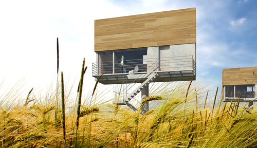
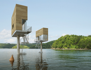
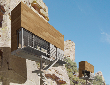
I had a good look around but couldn't pass this up, from an American magazine(CORE 77), about some Polish architects.


Like an inhabitable billboard, the Single Hauz – by Poland's front architects – proposes cantilevering domestic living space from a central mast. The house can then be installed above a variety of ground conditions, from the middle of a meadow to an urban core.
Personally... I'd put it in a lake.


The cool thing is that I've actually spent 11 months of my life staring up at some of the Herculean billboard structures in Los Angeles; they tower over intersections on streets from Venice to Sepulveda and often seem as large as houses.
But how much weight could a billboard carry?


Could you build a house up there?
Could you use the mast-and-cantilever model for other types of architectural structures, whether those are single-family houses – whole cul-de-sacs lined with modernist billboard homes! – or even restaurants and public libraries?
The Single Hauz shows how beautiful the effect could be.


For more projects by front architects, check out their website (though I couldn't find any information in English). www.frontarchitects.pl

ITALIAN MAG


ARTLAB is an Italian Design magazine, which provides new and sometimes confronting images and designs in the world of graphic design. These images can sometimes shock the audience and they make the viewers question and take interest in the motive and the message conveyed. This magazine focuses on different imageries and each issue centres on a specific theme or graphic style that is the hinge-pin for articles in the areas of: design, top applications, contemporary art, photography, web design, illustration, fashion, music and video, environmental graphics, cinema, etc. Beyond the central theme, additional articles appear on type design, interior architecture, theatre and staging, and ethics - as well as on professional themes of general interest. I thought this magazine cover conveys the style of this magazine quite well.
Link: http://www.media.icograda.net/web/idmn.shtml?m=artlab

HEAD EXPLODY


Fiend magazine is an Australian style, art, culture and music magazine aimed at the demographic of the Gothic subculture. As well as the pleasing mix of topics, the layouts and fonts used are quite irregular, unique and unusual. It is incredible as the only colours used in the magazine are on the inside and outside of the front and backs covers. The content and design work throughout is so interesting that it makes the use of only black, white and greyscale actually complement the structure of Fiend magazine and is appropriate for the target market as its readers are probably the type not wanting to be blinded by over use of colours. This production choice is also environmentally friendly due to less harsh chemicals being used to print.
There is a general use of Gothic fonts such as the sublime, ‘Velvet’ style and old copperplate styles yet all of the typefaces intimately relate to the articles, interviews, reviews etc. whether it be about A Perfect Circle, Rammstein, The Dresden Dolls, Opeth, Man Ray, classic or modern film reviews, Platform Boots, Cemeteries, Doctor Who, or Batrisha comics. Fiend intricately intertwines all the elements to create a fascinating tasteful read.
The FIEND team consists of people in the positions of Editor, Creative Director, Sub Editors, Design + Layout, Additional Design + Layout, Contributors, Advertising and Web Design.
You must see their music review ratings > kitty rates the noise ☺I rate this mag HEAD EXPLODY BRILLIANT KITTY FANTASTICO!

Monday, August 27, 2007

paula - Pentagram gets the Sak...


This is the case study of the redesign of the logo and packaging for SAKS FIFTH AVENUE in New York, a luxury store with a long history of providing goods to its elite customers.

Saks had had a series of typographic, signature type, logos over its history, but in 2004 they wanted to bring their brand into the modern world. It was important that current customers could recognise, the progressive design as well as attracting new customers

.


One typographic image stood out from the others, it was recognisable to the masses as 'THE' saks logo even though it had been 30 years since it had been used and had been superceded several times.


After much brainstorming in the Pentagram agency the historic logo was placed within a black square and then divided into 64 smaller squares. The tiles could be infinately arranged into different outcomes, giving the designers alot to play with.

The historic colours - Black & White where retained & the recognisable signature remains. However the end result is modern & very stylish - Very New York.

I LOVE IT...

Friday, August 24, 2007

Cocojambo ~ Case study


Cocojambo is a Gold Coast graphic design company with a unique attitude toward the media industry.

Their philosophy is to change the message from “what’s being sold” to
“What’s Being Bought”.

One of their case studies particularly caught my attention when viewing their website.

THE MBO HUNTING PARTY

An investment group approached Cocojambo to come up with a strategic plan to attract ten high net worth individuals for investment into a Management Buy Out
Scheme of private companies of worth $50-$100 mill.

The advertising plan needed to convey the business concept and approach, the funds required, the acquisition targets and the exit plans.

The Cocojambo team first asked “Who are the customers?”. After research, it was evident that due to the enormous amount of screening done by staff and entourage of this elite target market, a different approach needed to be taken. The advertising package needed to be attractive to this elite market. The only thing that would interest one individual would be the other nine individuals. An elite club. Something these ten individuals could relate to and get excited by.

With a 1920’s gentleman’s club feel, “The MBO Hunting Party” was introduced.
The use of the finest paper stock, embossing, foils and metallic inks, as well as a 10 colour print process produced very personalised invitations with an aristocratic feel.
Completing the packaging with a wax seal complimented the excitement of exlcusive invitation to invest and become a part of the club.

The company directors were introduced as ‘trackers’ surveying the landscape for their target ‘game’.

This advertising strategy was not to sell anything but to communicate to their target market on a level that would interest them.

The investment group allowed six months to the review and selection process. However the allocation of available space was oversubscribed with three weeks.

I thought that this was a very clever strategy and very classy in their presentation.
And clearly hit the nail on the head with the direction they took for their client.


Links: www.cocojambo.com

Wednesday, August 22, 2007

COLORS - Welcome to Vorland

Welcome to Vorland - Your Next Sustainable holiday.

Most of us in this class have heard of COLORS the Italian magazine so I was curious to see what it was all about. The concept for their latest issue blew me away it was completely surreal.

COLORS moves to the future- Summer 2057, to Vorland, a small Swedish island, which was once freezing and nearly inhospitable but has now become due to global warming, one of the ultimate summer holiday spots. The whole issue is entirely fictional.

Through the photos, stories and interviews of the weird inhabitants of Vorland the magazine investigates the effects of climate change and how to reverse them through sustainable living through this surreal world. The humour of the images grabbed my attention initially but the stories drew me into this surreal future with weird people, and odd inventions. Here are a few examples-

The effects of global warming.

“I get a funny sensation being here. It’s something like euphoric pain.”Pia, 14

Provides an alternative to physical traveling by showing live stream video on screens run by pedal power.

Turns rainwater storage from necessity to accessory by means the Cambrella Pack.

Monument to the Petroleum Era. The inscription on the plaque-“If you burn the planet, the planet will burn you.”

I found the COLORS website to be very thought provoking you should go have a look if you want at- http://www.colorsmagazine.com/home/